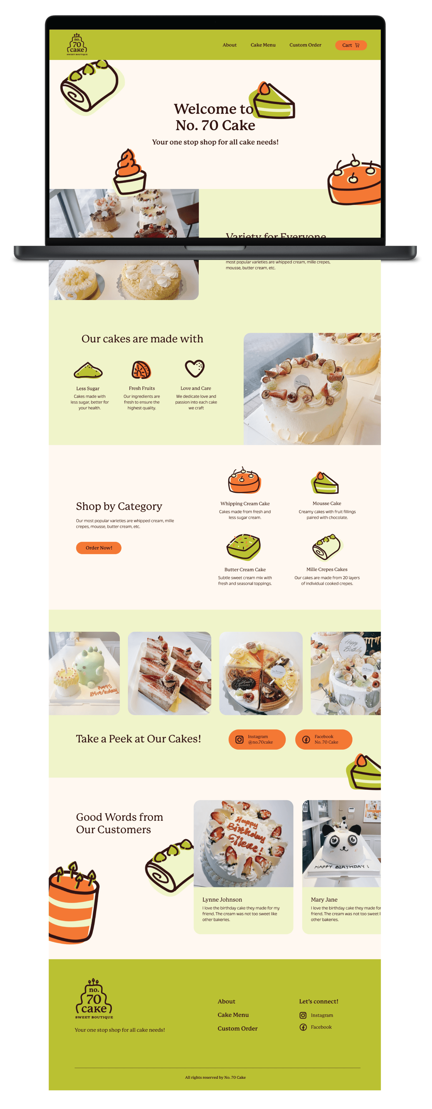
There are a few problems with their current website that would discourage potential customers from ordering cakes. Some of these prominent challenges are:
1. No fast, convenient and easy for customers to order ready-made cakes or custom cakes online.
2. Too little information to highlight the brand, their values and selling point.
3. Inconsistent image size and layout design between pages, making them appear unprofessional.

To solve these problems for the client, it is important to research the market to see what other solutions are being offered to customers and learn from what their competitors are doing right as well as wrong.


Through research, I uncovered 2 demographics which would be the main consumer for the bakery: people who plan and order custom cake ahead of time and people who don’t.
With this information in mind, I created 2 personas to help understand what influences their needs and goals as well as figure out the cause of frustrations for these consumers.


Based on how the frustrations presented by the persona aligns with the bakery's current problem, I came up with a few solutions that can potentially deliver a better user experience as well as drive more sale:


With the project objectives clearly laid out, it was time to organize all of this information into a sitemap that would be logical and convenient for users. From the solutions provided, it was clear that 3 features needed to be prioritized, which include: ordering ready-made cakes, ordering custom cake on long notice and ordering custom cake on short notice.
Based on the 3 features prioritized, it made the most sense to figure out the user flow of consumers who will be using these features to complete their tasks, which will help identify possible screen designs choices.


I started out the low fidelity wireframes by laying down different ideas for the design on paper and quickly moved on to building the mid-fidelity screens to solidify the design and add smaller details.


My favorite part of the whole process was to create a new logo and mini brand guide that can work well within the new website design. I wanted their brand to feel friendly and modern, which is why I chose the playful duo, bright green and orange, to be the primary colors. Accompanying these 2 bright hues is also dark brown, light beige and light green to create contrast.
To express the playfulness of their brand, I opted for hand drawn line illustrations filled in with solid colors. For font choices, I paired a rounded serif font, P22 Mackinac Pro, with a simple sans-serif typeface, Massilia, to continue the brand's playful theme.

Once happy with the branding, I applied it to the mid-fidelity frames to arrive at these high fidelity screens and final user flow videos.


With the high fidelity prototype finished, the next phase is to conduct usability testing and refine the website to meet users' needs and goals. Nevertheless, I am very happy with how this project is going so far and the high fidelity prototypes turned out way better than expected.
